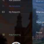
Pocketutors App
Problem
Pocketutors came to me looking for help with the development of their iOS application. The idea for the app had already been formed by the founder, but needed to be refined in group discussions.
Goals
- Flesh out the specifics of how the app will work
- Design the iOS version of the app
- Develop demo of application through hotspots and mockups
- Provide developers all assets needed
- Make UI/UX very intuitive
Research
In the design of the application, we reference several existing apps and the way they onboarded users. Through our analysis, we realized most of the applications were so intuitive that the users need little to no tutorials explaining how to use the app. Some of these apps included: Knack, Uber, and Airbnb. We used these three apps as inspiration for the design of Pocketutors.
Solution
Through several meetings with the client, we developed the functionality of the app. From there, I took the documentation and created a wireframe of the screens within the app. This wireframe included arrows and notes indicating the flow and functionality. Once this was completed, we met and refined the design based on the clients experience with a test group at Baylor. The updated wireframe was used for the start of the high-fidelity mockups.
As the hi-fi mockups were completed, they were placed into an Invision project to demonstrate the flow of the application. Once all mockups were completed, the prototype was shared with the client. The client and test group gave feedback on the application, which was updated and eventually finalized into what you see above.


