Osaic Top Producer Branding


Following the Advisor Group’s rebrand to Osaic, our team was entrusted with developing distinctive branding for their newly established top producer recognition events. We were tasked with creating elevated and cohesive visual identities for each performance tier, ensuring they resonated with the overarching Osaic brand while possessing their own unique character.
Problem
The challenge was to create a tiered branding system for Osaic's top producer events that clearly differentiated achievement levels while maintaining a strong connection to the core Osaic brand identity. We needed to develop visual elements – including color palettes, typography, and logos – that felt both distinct and part of a unified brand family, ultimately enhancing the prestige and recognition associated with each tier.
Goals
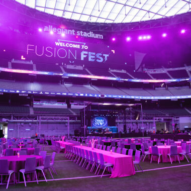
- Develop four distinct sub-brands corresponding to the top producer tiers: Oasis, Ovation, Optimum, and Odyssey.
- Establish clear visual hierarchies between the tiers.
- Create comprehensive brand guidelines for each tier, encompassing unique color palettes, font selections, and logos.
- Ensure that each tier's branding felt like a natural and elevated extension of the core Osaic brand, maintaining brand recognition and consistency.
Research
Our research commenced with a thorough examination of Osaic's existing brand guidelines to internalize its core visual DNA. We then explored the established symbolism of bronze, silver, and gold in representing achievement, alongside analyzing competitor branding within similar top producer programs to identify effective strategies and opportunities for unique positioning. This informed iterative design explorations focused on the sophisticated integration of the tiered metallic accents while ensuring brand alignment and versatility across various event materials.
Solution
We successfully developed four distinct yet cohesive sub-brands for Osaic's top producer events: Oasis, Ovation, Optimum, and Odyssey. The solution incorporated:
- Tiered Metallic Accents: Bronze, silver, and gold were strategically integrated into each sub-brand's visual identity to clearly denote the respective achievement level.
- Unique Brand Guidelines: For each tier, we created comprehensive guidelines outlining specific color palettes that complemented the metallic accents, distinct yet harmonious font pairings, and unique logos that subtly reflected the tier name while maintaining Osaic's visual language.
- Elevated Brand Extension: The resulting sub-brands successfully captured the prestige of the top producer events while feeling like a natural and elevated extension of the core Osaic brand, ensuring brand recognition and a cohesive overall brand experience.